I never presented the full warband for Warhammer underworld after the tutorials, let's correct this!
You can find full step by step on the painting process in my previous articles:
I’ve been hooked by Shadespire, it’s pretty new, small and easy to play but hard to master, I’ve played more shadespire than 40k and AoS in the last year, soooo easy to set up it’s a joy!
Since the numbers of bands is limited, I wanted to convert my team to be able to recognise them at first sight. The models are push fit, but it doesn’t mean you can’t convert them. Cutting the little tab is an easy way to move bits around just like changing a weapon.
A small number of model also mean I can try to push my painting since it’s “just” 3 miniatures, little I knew it would take me 3 months to finish this project!
I decided to paint them using non-metallic metal, I really like this technique, but I can’t see myself using it on a full-scale army, so a team of 3 members is the perfect opportunity to try it!
My first victim was Oberyn, I quite like the miniature with his stern look, the giant hammer is carrying around mean he’s not joking around. To emphasize this effect, I choose to cut the parchment flying from the head of the weapon and made him look in the same direction as the head of the hammer and slowly down to give him the expression of a monster ready to smash the vermin crawling at his feet.
I choose the colour to keep in line with the blue-green atmosphere you find in almost every artwork of Shadespire, which are mostly cold colours and give this impression of a depressing environment (A accurate description of this city), but to give it more interest and contrast I painted a strong copper and applied some orange rust to break the armour panels.
 |
| Excuse the white font, I forgot to take a pic on the black one |
All the recess of the blue armour has been glazed with a deep red to give a deeper contrast, I tried to apply different kind of textures on the materials, the leather and clothes use the stippling method as opposed to the smooth blending of the armour to help differentiate them.
The weapon were painted jade to make them look like the shadeglass weapon on the cards.Every part has been weathered to represent the rigour of battle, with scratches and tears. A simple black line underlined with your highlight colour will do the trick (you can find more details in part 2 of my tutorial).
The miniatures are quite dark, I choose to paint the pavement in a lighter tone to make the miniature stand out on a white stone floor, I used a sponge to paint all the stone and applied a few glazes of the different colours found on the mini to link them together. The leaves are crimson red to represent the flora responding to the blood spilled in everyday battle around the city.
I choose to replace completely the second member, I find Angharad a bit bland and I was already looking for an excuse to paint Neave Blacktalon. Using her as a base, I cut the arm to reposition the axe and use the original shield on the front hand, the spikes on the collar have been also cut out to make her less ornamented, but I’ve kept the original base, I just had to plug the front hole since I’m not using it.
 |
| Many shot for my favorite mini of the team :p |
A little blue make-up to finish her eyes and she was ready for action!
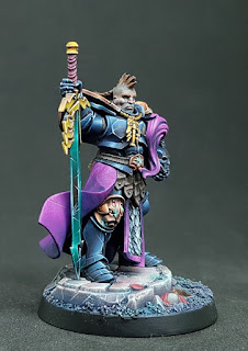
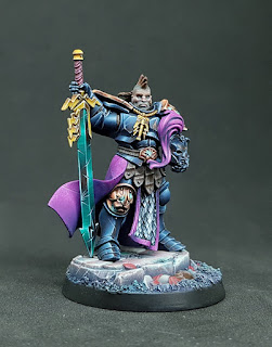
Two members being done, we’re left with the leader, Severin Steelheart himself. The first thing I’ve done was cutting the head off, I wanted a head a bit more savage looking, quite similar to a Viking like Neave. I’ve used a marauder horseman head with a mohawk and found it was enough to make him different (and it’s a bit more work to modify him). I’ve also painted him in sub-assemblies to facilitate the painting of the sword and cloak principally.
The miniature has been painted in the same way as the previous ones with more cooper to make him stand out, the cloak was a fun exercise in stippling, spoiler it cost me one brush!
Quick tip, don’t use your best brush for stippling, it is quite hard on the brush’s hairs.
The flesh tone of his face is much darker than Angharad and you can clearly see the difference in contrast, I’ve used some desaturated brown to give this colder effect, a little stubble using some glaze of dark sea blue complete the rugged look.
The full team
Hope you enjoy this article and the blog, I'm happy to report we passed 10'000 visit and coming close to 15'000 !
Thank you very much for your interest and let me know if there is a subject you'd be interested in?
Anamnesis


No comments:
Post a Comment